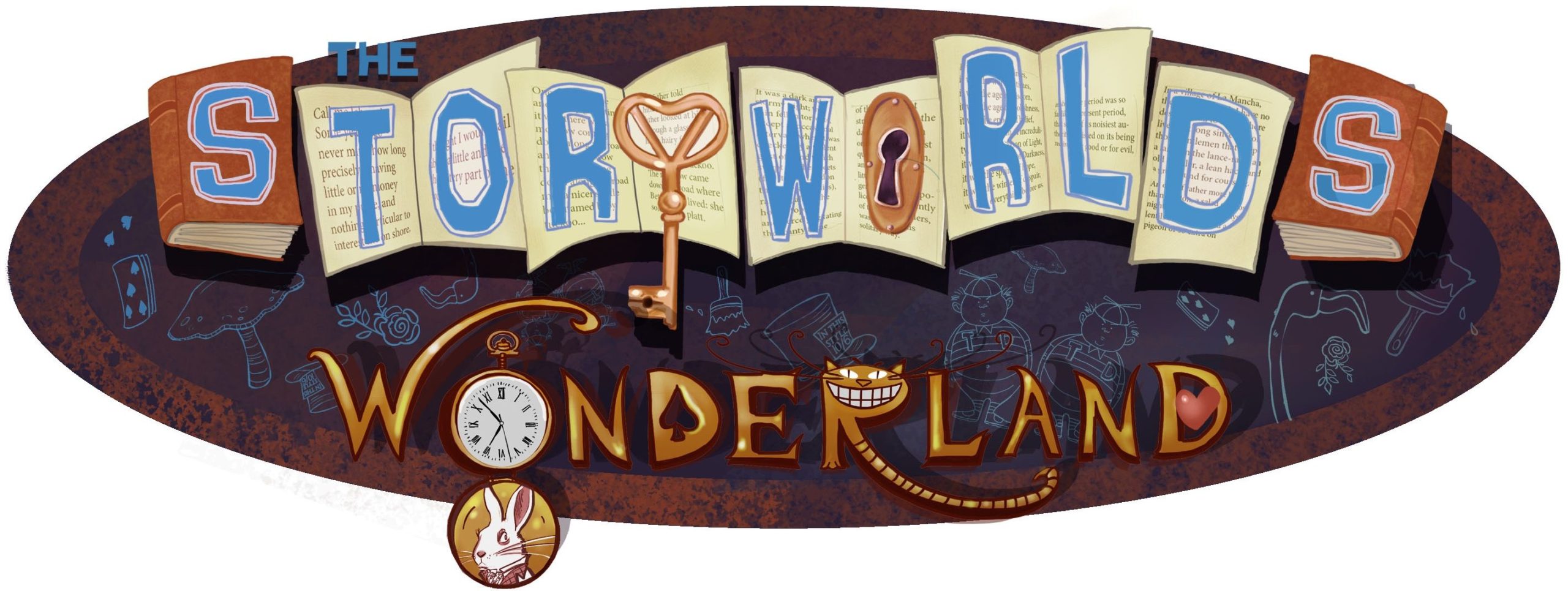
This week we’re working on the title treatment art for the first book in The Storyworlds series, Wonderland. I actually chose the general design from earlier treatment concepts for The Storyworlds so here we’re working on how to best merge both designs for the cover.
We’re going to swap the sizes of the two treatments, so The Storyworlds will be smaller and Wonderland will be larger. We’re also going to add story specific ghosted icons (like the whale in The Storyworlds treatment) for Wonderland – the Cheshire Cat, Drink Me bottles, etc.
Feedback is always welcome!


I like the first one the best. The gold font is the cleanest for reading. And the stopwatch looks the most like a stopwatch in that one.
Thanks for the feedback, Zach, and I completely agree. You’ll see that color in the final.